19 Beautiful Macaron Color Combination Ideas
Disclosure: Some of the links in this post are affiliate links. This means if you click on the link and purchase an item, I will receive an affiliate commission at no extra cost to you.
Macarons can look completely different before you even take the first bite. A thoughtful color combination can make simple shells feel elegant, playful, romantic, or perfect for a special celebration.
Soft pastels create a delicate appearance, while deeper shades give macarons a richer and more dramatic feel. You can also combine two or three colors to create contrast without making the finished batch look chaotic.
Think about the flavor when choosing your colors. Raspberry can inspire rosy pink shells, pistachio works beautifully with soft green, and lemon looks lovely in sunny yellow.
Your filling can also influence the palette. A dark chocolate center might look striking against pale shells, while a bright fruit filling can complement cheerful shades.
For bakers still learning the basics, The Complete Beginner’s Guide to French Macarons offers a helpful foundation before you start experimenting with color.
These macaron color combination ideas will help you create batches that look intentional, photograph beautifully, and match everything from everyday treats to elegant dessert tables.
19 Beautiful Macaron Color Combination Ideas
1. Blush Pink and Cream
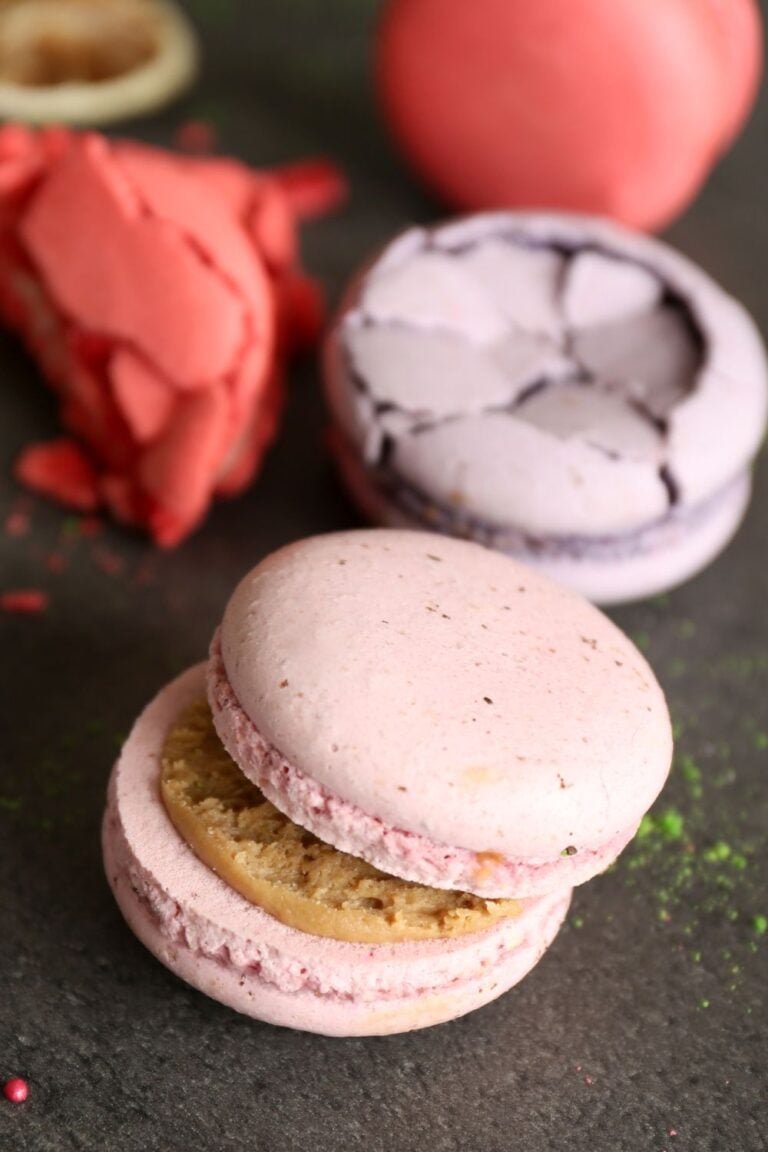
Blush pink and cream create a soft combination that feels delicate without looking overly sweet. This palette works beautifully for weddings, bridal showers, baby celebrations, and elegant dessert tables.
Use a muted pink for one shell and warm cream for the other. You can also keep both shells pink and add cream-colored details through the filling or decoration.
Vanilla, raspberry, strawberry, and white chocolate fillings complement this palette particularly well. A tiny sprinkle of edible pearl dust can add a polished finish without making the macarons look excessive.
2. Sage Green and Ivory
Sage green brings a calm, natural quality to macaron displays. Pairing it with ivory keeps the overall palette soft and sophisticated.
This combination works beautifully for garden parties, spring celebrations, and minimalist dessert tables. Pistachio, vanilla, coconut, and lemon flavors fit naturally into the color story.
Use slightly different shades of green if you want more dimension. A pale sage shell beside a deeper muted green shell can create a beautiful contrast.
If you are still learning how to achieve smooth, consistent shells, The Complete Beginner’s Guide to French Macarons can help you strengthen the basics.
3. Lavender and Soft Purple
Lavender and soft purple create a dreamy macaron combination with plenty of personality. The two shades look related without blending into one flat color.
This palette works especially well with floral flavors such as lavender, blueberry, vanilla, and blackberry. You can also add a tiny amount of white to soften the darker purple.
Keep the colors muted if you want an elegant appearance. Bright purple can create a more playful result for birthdays and colorful celebrations.
4. Dusty Blue and White
Dusty blue and white create a clean, airy appearance. This pairing works particularly well for winter parties, baby celebrations, weddings, and coastal-inspired dessert tables.
White shells can provide a simple contrast against blue shells. You can also reverse the arrangement and use white filling between blue shells.
Vanilla, blueberry, lemon, and white chocolate make excellent flavor matches for this palette.
For a more polished baking setup, you can also explore Aesthetic Baking Setup Ideas For Beginners for ideas that complement beautiful dessert photography.
5. Peach and Coral
Peach and coral create a warm, cheerful combination that feels perfect for spring and summer.
Use pale peach for one shade and a slightly stronger coral for the second. This approach creates contrast while keeping the palette cohesive.
Mango, passion fruit, orange, strawberry, and vanilla fillings work particularly well with these colors.
Add a tiny amount of gold decoration if you want a more glamorous presentation. Keep the metallic details minimal so the peach and coral remain the focus.
6. Mint Green and Pale Pink
Mint green and pale pink create a playful combination with a vintage dessert-shop feel. The colors complement each other without competing for attention.
This palette works beautifully for birthdays, afternoon tea, bridal showers, and spring gatherings.
Strawberry, raspberry, pistachio, vanilla, and white chocolate fillings can all fit naturally into this theme.
Use pastel versions of both colors for a softer result. Stronger shades can create a more youthful and energetic display.
7. Chocolate Brown and Caramel
Chocolate brown and caramel create a rich color combination that instantly suggests indulgence. This palette works especially well for autumn gatherings, dinner parties, and sophisticated dessert tables.
Use deep brown shells alongside warm caramel-colored shells. A salted caramel or chocolate ganache filling can reinforce the visual theme.
You can also add a small sprinkle of flaky salt to the finished macarons. The contrast between dark shells and golden caramel creates a striking presentation.
8. Black and Gold
Black and gold create one of the most dramatic macaron combinations. This palette works beautifully for birthdays, anniversaries, New Year’s celebrations, and upscale dessert tables.
Keep the black deep and the gold subtle. Too much metallic decoration can make the macarons look overly busy.
Dark chocolate, espresso, salted caramel, and hazelnut fillings work particularly well here.
Gold splatters can add interest without covering the entire shell. A few carefully placed details often create a stronger visual effect than heavy decoration.
9. Burgundy and Blush
Burgundy and blush create a romantic palette with more depth than traditional pink combinations. The contrast makes each color stand out.
This pairing works beautifully for weddings, Valentine’s Day, engagement parties, and autumn celebrations.
Raspberry, cherry, chocolate, vanilla, and strawberry fillings can complement the palette.
Use burgundy sparingly if you want a lighter presentation. A mostly blush collection with a few burgundy macarons can create a beautiful balance.
10. Navy Blue and Ivory
Navy blue and ivory create a classic combination that feels polished and timeless. The deep blue provides strong contrast against the warm softness of ivory.
This palette works well for formal celebrations, evening parties, birthdays, and elegant dessert displays.
Vanilla, blueberry, lemon, coconut, and white chocolate flavors pair naturally with these colors.
You can also add tiny silver details for an evening-inspired presentation. Keep the accents subtle so the navy remains visually dominant.
11. Lemon Yellow and White
Lemon yellow and white bring brightness to a macaron collection. The combination feels fresh, cheerful, and perfect for warm-weather events.
Use pale yellow instead of an intense neon shade for a softer appearance. White shells can then provide a clean contrast.
Lemon curd, vanilla, coconut, and white chocolate fillings complement the colors beautifully.
This palette also works well for brunches, garden parties, Easter gatherings, and spring celebrations.
12. Pistachio Green and Beige
Pistachio green and beige create a natural-looking combination with an understated elegance. These colors work especially well for minimalist dessert tables.
The palette naturally suits pistachio-flavored macarons. You can also introduce almond, vanilla, coffee, or white chocolate flavors.
A few crushed pistachios around the display can reinforce the color story. Keep the presentation simple so the muted shades remain the focus.
Understanding how ingredients affect your recipes can also improve your experiments. Baking Ingredients Explained offers a useful reference when developing new flavors.
13. Terracotta and Cream
Terracotta brings warmth and character to macaron displays. Pairing it with cream softens the earthy orange-red shade.
This combination works beautifully for autumn weddings, rustic gatherings, dinner parties, and warm-toned dessert tables.
Try pairing these colors with cinnamon, orange, caramel, chocolate, or vanilla flavors.
You can also use dried floral decorations or natural textures around the display. Wooden boards and neutral serving pieces can reinforce the earthy theme.
14. Baby Blue and Pale Pink
Baby blue and pale pink create a cheerful pastel combination. The colors work especially well for birthdays, showers, spring celebrations, and playful dessert displays.
Keep both shades light to maintain the soft appearance. Stronger colors can shift the palette toward a more energetic look.
Vanilla, strawberry, blueberry, raspberry, and white chocolate fillings work beautifully here.
You can alternate the colors throughout the display instead of placing all the blue macarons together. That arrangement creates a more balanced visual effect.
15. Emerald Green and Gold
Emerald green and gold create a luxurious combination with strong visual impact. The deep green provides a dramatic base while gold adds warmth.
This palette works beautifully for Christmas, formal celebrations, milestone birthdays, and glamorous dessert tables.
Pistachio, chocolate, mint, caramel, and vanilla flavors can complement the colors.
Use gold as an accent rather than the main color. Small gold splatters or delicate edible details can make the emerald shells stand out beautifully.
16. Raspberry Pink and Red
Raspberry pink and red create a bold combination for anyone who loves vibrant macarons. The colors share similar undertones, so they work together without looking disconnected.
This palette suits Valentine’s Day, birthdays, romantic celebrations, and colorful dessert tables.
Berry fillings naturally complement the shades. Raspberry, strawberry, cherry, and dark chocolate can all work beautifully.
Use different intensities of pink and red to create depth. A pale raspberry shell beside a deeper red shell can look particularly striking.
17. Cream, Champagne, and Gold
Cream, champagne, and gold create a sophisticated palette for elegant celebrations. The three shades work together because they share warm undertones.
This combination works particularly well for weddings, anniversaries, bridal events, and upscale dessert tables.
Vanilla, champagne-inspired flavors, white chocolate, caramel, and almond can complement the visual theme.
Avoid using too many metallic details. A few delicate gold accents can make the entire collection feel more refined.
18. Orange and Chocolate
Orange and chocolate create a warm combination that feels rich and inviting. The bright orange adds energy while the brown grounds the palette.
This pairing works especially well for autumn parties and Halloween-inspired dessert tables.
Chocolate orange ganache makes an obvious flavor match. You can also use caramel, coffee, vanilla, or orange curd.
Choose burnt orange for a sophisticated autumn palette. Bright orange works better when you want a playful and festive appearance.
19. Rainbow Pastels
Rainbow pastels give you the freedom to combine several soft colors in one macaron collection. Pink, yellow, blue, green, purple, and peach can work together when you keep their intensity similar.
This palette suits birthdays, children’s celebrations, baby showers, spring parties, and colorful dessert tables.
The key involves consistency. Keep all the shades equally soft instead of mixing pale pastels with very dark colors.
You can give each color its own flavor or use one filling throughout the collection. A variety of fillings creates more excitement, while one filling keeps preparation simpler.
How to Choose Macaron Colors That Look Good Together
Start with two colors when you feel unsure about your palette. Two carefully chosen shades can look more polished than five unrelated colors.
Look at the undertones before choosing your colors. Warm shades such as peach, coral, cream, and caramel usually work well together.
Cool shades such as lavender, dusty blue, sage, and soft gray can also create a cohesive collection.
You can add one accent color after choosing your main shades. Gold, white, cream, or chocolate brown can help connect contrasting colors.
Your color choices should also complement your filling flavors. A bright lemon macaron can look even more appealing when you use a soft yellow shell.
How to Match Macaron Colors With Flavors
Color can help communicate flavor before someone takes a bite. That visual connection can make your macarons feel more intentional.
Pink works naturally with strawberry, raspberry, rose, and cherry. Green can suggest pistachio, mint, matcha, or lime.
Yellow suits lemon, mango, and passion fruit. Brown naturally fits chocolate, coffee, caramel, and hazelnut.
Purple can represent blueberry, blackberry, ube, or lavender. Orange works beautifully with citrus, pumpkin spice, and orange chocolate.
You do not need to follow these associations strictly. Unexpected combinations can make your macarons more memorable.
How to Create Two-Tone Macaron Shells
Two-tone macarons can create beautiful results without complicated decoration. The easiest approach involves preparing two colored batters and placing them together inside the piping bag.
Work carefully when combining the colors. Excessive mixing can blur the shades and remove the contrast.
Use colors with enough difference to remain visible after baking. Very similar shades may merge into one color.
Practice on a small batch before making a large quantity. Macaron batter requires careful handling, so The Science of Baking Made Simple for Beginners can help you understand why technique matters.
How to Get Consistent Macaron Colors
Consistent color starts with accurate ingredient measurements. Small changes in your batter can affect both appearance and texture.
Use gel or concentrated food coloring when possible. Liquid coloring can introduce additional moisture and affect the consistency of your batter.
Add coloring gradually rather than pouring in a large amount at once.
Remember that baked shells may look slightly different from the raw batter. Test a small amount if you are trying to achieve a very specific shade.
Keep notes about the amount of coloring you use. Your records can help you recreate the same color later.
How to Choose Colors for a Macaron Dessert Table
Think about the entire display rather than the macarons alone. Your serving trays, tablecloth, flowers, cake, and other desserts can influence how the colors appear.
Choose a dominant color and two supporting shades. This approach keeps the display cohesive.
For example, sage green can dominate while ivory and gold provide supporting accents.
You can also use one macaron color as a bridge between different desserts. This technique helps the entire dessert table feel connected.
For additional dessert presentation inspiration, explore 19 Beautiful Dessert Charcuterie Board Ideas.
Macaron Color Ideas for Weddings
Wedding macarons often look best with soft, coordinated shades. Blush, cream, champagne, sage, dusty blue, lavender, and muted peach all offer beautiful options.
Match the colors to the wedding flowers or stationery for a more intentional display.
You can also create a monochromatic collection using several shades of one color. Different intensities create dimension without introducing too many competing tones.
Small metallic details can add elegance when you use them carefully.
Macaron Color Ideas for Birthdays
Birthday macarons give you more freedom to experiment with color. Bright pink, purple, blue, yellow, orange, and green can create a cheerful collection.
For an adult birthday, consider deeper shades such as burgundy, emerald, navy, or chocolate brown.
You can also create a color palette based on the birthday person’s favorite color.
A coordinated collection can make even simple macarons feel custom-made for the celebration.
Macaron Colors for Holidays
Holiday macarons offer plenty of opportunities to play with recognizable color combinations.
Christmas works beautifully with emerald, burgundy, cream, white, and gold. Valentine’s Day suits red, blush, burgundy, and soft pink.
Easter can feature lavender, pale yellow, mint, baby blue, and peach.
Halloween naturally invites orange, black, purple, and deep green.
You can also use seasonal colors without adding themed decorations. The palette alone can communicate the occasion.
How to Make Macarons Look More Elegant
Elegant macarons usually benefit from restraint. Choose a small color palette instead of adding every shade you like.
Keep the colors consistent across the batch. Uneven shades can make the collection look less polished.
Simple decoration can also create a stronger result. A few gold splatters, edible pearls, or delicate chocolate lines can add visual interest without overwhelming the shells.
Presentation matters just as much as shell color. A clean tray and thoughtful arrangement can make the macarons look far more sophisticated.
If you enjoy creating visually appealing baking content, Baking Flat Lay Ideas For Instagram & Pinterest can provide useful styling inspiration.
How to Store Colored Macarons
Colorful macarons need the same careful storage as other filled macarons. Keep them inside an airtight container to protect their shells and fillings.
Avoid placing strongly colored macarons against lighter decorations for long periods. Some colors may transfer slightly through contact.
Use parchment between layers when stacking them.
Refrigeration can work well for fillings that require it. Let the macarons return to a comfortable serving temperature before enjoying them.
For more practical guidance, see Best Food Storage Containers for Bakers.
Common Macaron Coloring Mistakes
Adding too much liquid food coloring can change your batter consistency. That change can make piping and shell development more difficult.
Overmixing can also affect the final appearance. Your batter needs enough mixing to reach the correct consistency without becoming excessively loose.
Another common mistake involves choosing colors without considering the filling. A visually beautiful shell can feel confusing when its color suggests a completely different flavor.
You can also lose contrast by choosing shades that look almost identical.
If you run into problems during the process, Common Baking Mistakes and How to Fix Them Fast can help you troubleshoot broader baking issues.
How to Plan Your Own Macaron Color Palette
Choose one main color first. Then select a second shade that creates enough contrast.
Add a neutral such as cream, white, beige, or gray if the palette needs balance.
Next, think about the filling flavors. Make sure the colors and flavors tell a reasonably clear story.
Finally, consider the occasion and surrounding decorations. Your macarons should complement the overall setting rather than compete with it.
Take a quick photo of your proposed palette before mixing your batter. Seeing the colors together can help you spot combinations that need adjustment.
Final Thoughts
Macaron colors can turn a simple batch into something that feels carefully designed. The right palette can communicate mood, flavor, season, and occasion before anyone takes a bite.
Soft combinations such as blush and cream create a delicate appearance. Deeper palettes such as emerald and gold bring drama, while bright combinations such as peach and coral create a cheerful feel.
Start with two or three colors that share a clear connection. Match them with complementary flavors, then use simple decorations to bring the collection together.
Do not feel limited to traditional macaron colors. Unexpected combinations can create some of the most memorable dessert displays.
Most importantly, keep your palette intentional. A few well-chosen shades can make your macarons look polished, beautiful, and completely ready for the spotlight.